Recreating Quartz charts
Jun 7, 2018 21:13 · 1898 words · 9 minute read
Visualizing Hamilton and musicals data
Let’s play around with this data set from the Quartz article about race in musicals and plays on Broadway.
Bring in the data.
broadway <- read.csv("data/broadway.csv", stringsAsFactors=F)Let’s see if we can replicate this chart.

Quarts chart 1
We’ll use ggplot2, dplyr, and the scales package.
library(ggplot2)
library(scales)
library(dplyr)
##
## Attaching package: 'dplyr'## The following objects are masked from 'package:stats':
##
## filter, lag## The following objects are masked from 'package:base':
##
## intersect, setdiff, setequal, unionlibrary(forcats)
ggplot(broadway, aes(x=year, y=actors, fill=ethnicity)) +
geom_bar(position="fill", stat="identity") +
scale_y_continuous(labels=percent_format())
Close.
We need to reorder and move the legend to the top, as well as add a Title and get rid of X and Y labels.
# Rename ethnicities so it matches the chart
broadway$ethnicity <- gsub("African American", "Black", broadway$ethnicity)
broadway$ethnicity <- gsub("Asian American", "Asian", broadway$ethnicity)
broadway$ethnicity <- gsub("Caucasian", "White", broadway$ethnicity)
broadway$ethnicity <- gsub("Latino", "Hispanic", broadway$ethnicity)

broadway$ethnicity <- as.factor(broadway$ethnicity)
#levels(broadway$ethnicity) <- c("White", "Black", "Asian", "Hispanic", "Other")

# Set up the Quartz color palette

qzPalette <- c("#c56bb6", "#244763", "#51b2e5", "#01609f", "#c4c4c4")

ggplot(broadway, aes(x=year, y=actors, fill=factor(ethnicity, levels=c("White", "Black", "Asian", "Hispanic", "Other")))) +
  geom_bar(position="fill", stat="identity") +
  scale_y_continuous(labels=percent_format()) +
  theme(legend.position="top") +
  scale_fill_manual(values=qzPalette) +
  labs(fill="") +
  labs(x=NULL, y=NULL, title="Race/ethnicity of actors on Broadway", subtitle=NULL,
                caption="Data: Asian American Performers Action Coalition\nQuartz | qz.com") +
  theme(panel.border=element_blank()) +
theme(panel.grid.minor=element_blank()) 
Pretty nice.
Next chart:
Second QZ chart
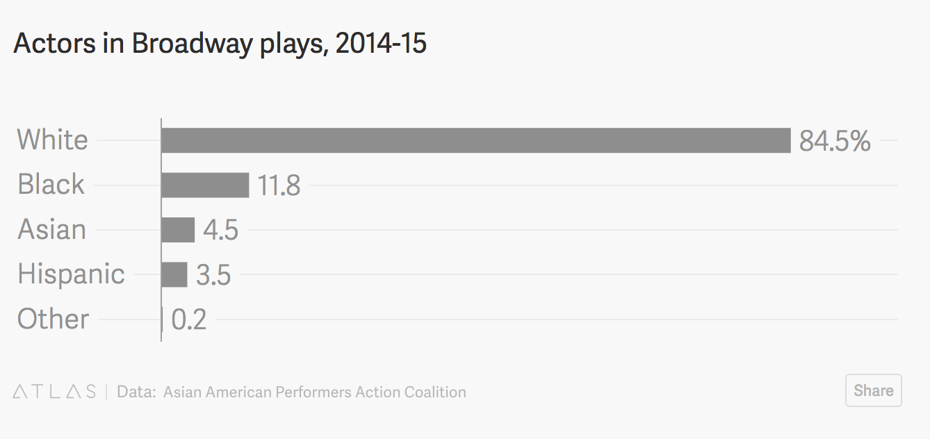
broadway2015_plays <- subset(broadway, year=="2014-2015" & type=="Play")

ggplot(broadway2015_plays, aes(x=ethnicity)) +
  geom_bar(stat="identity", aes(y=actors/sum(actors))) +
  scale_y_continuous(labels=percent_format()) +
  theme(legend.position="top") +
  scale_fill_manual(values=qzPalette) +
  labs(fill="") +
  labs(x=NULL, y=NULL, title="Actors in Broadway plays, 2014-2015", subtitle=NULL,
                caption="Data: Asian American Performers Action Coalition\nQuartz | qz.com") +
  theme(panel.border=element_blank()) +
theme(panel.grid.minor=element_blank()) 
Alright, we gotta add some more lines of code to format it better. Like flipping the axis sideways and reordering the columns.
# Need to make a dataframe of percents

broadway2015_play_percent <- broadway2015_plays %>%
  group_by(ethnicity) %>%
  summarise(total=sum(actors)) %>%
  mutate(percent=round(total/sum(total),2))

ggplot(broadway2015_play_percent, aes(x=factor(ethnicity, levels=c("Other", "Hispanic", "Asian", "Black", "White")))) +
  geom_bar(stat="identity", position="dodge", aes(y=percent)) +
  geom_text(aes(y=percent, label=percent*100), hjust=-.5) +
  coord_flip() +
  scale_y_continuous(labels=percent) +
  theme(legend.position="top") +
  labs(fill="") +
  labs(x=NULL, y=NULL, title="Actors in Broadway plays, 2014-2015", subtitle=NULL,
                caption="Data: Asian American Performers Action Coalition\nQuartz | qz.com") +
  theme(panel.border=element_blank()) +
  theme(panel.grid.minor=element_blank()) +
  theme_minimal()
Should be easy to tweak the code for the previous code for the Quartz version.
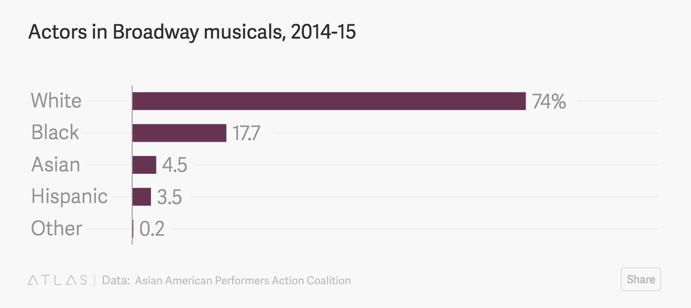
Third QZ chart
# Need to make a dataframe of percents

broadway2015_musical_percent <- broadway %>%
  filter(year=="2014-2015" & type=="Musical") %>%
  group_by(ethnicity) %>%
  summarise(total=sum(actors)) %>%
  mutate(percent=round(total/sum(total),2))

ggplot(broadway2015_musical_percent, aes(x=factor(ethnicity, levels=c("Other", "Hispanic", "Asian", "Black", "White")))) +
  geom_bar(stat="identity", position="dodge", fill="#703c5c", aes(y=percent)) +
  geom_text(aes(y=percent, label=percent*100), hjust=-.5) +
  coord_flip() +
  scale_y_continuous(labels=percent) +
  guides(fill=F) +
  theme(legend.position="top") +
  labs(fill="") +
  labs(x=NULL, y=NULL, title="Actors in Broadway musicals, 2014-2015", subtitle=NULL,
                caption="Data: Asian American Performers Action Coalition\nQuartz | qz.com") +
  theme(panel.border=element_blank()) +
  theme(panel.grid.minor=element_blank()) +
  theme_minimal()
Last chart. It looks complicated.

Broadway plays
# coord_flip reverses a lot of things, so we have to sort of reverse the order of colors and factors for this to work

qzPalette_reverse <- c("#c4c4c4", "#01609f","#51b2e5","#244763","#c56bb6")

broadway2015 <- filter(broadway, year=="2014-2015") %>%
  group_by(show) %>%
  mutate(total=sum(actors)) %>%
  arrange(total) %>%
  ungroup() %>%
  mutate(show=fct_reorder(show, -total))

ggplot(broadway2015, aes(x=show, y=actors, fill=factor(ethnicity, levels=c("Other", "Hispanic", "Asian", "Black", "White")))) +
  geom_bar(stat="identity") +
  coord_flip() +
  theme(legend.position="top") +
  scale_fill_manual(values=qzPalette_reverse) +
  guides(fill = guide_legend(reverse=TRUE)) +
  labs(fill="") +
  labs(x=NULL, y=NULL, title="Race/ethnicity of actors on Broadway shows, 2014-15 season", subtitle=NULL,
                caption="Data: Asian American Performers Action Coalition\nQuartz | qz.com") +
  theme(panel.border=element_blank()) +
theme(panel.grid.minor=element_blank()) 
Close! We need to get rid of the X axis values and add a column on the right of total actors.
ggplot(broadway2015, aes(x=show, y=actors, fill=factor(ethnicity, levels=c("Other", "Hispanic", "Asian", "Black", "White")))) +
  geom_segment(data=broadway2015, aes(y=0, yend=70, x=show, xend=show), color="#b2b2b2", size=0.15) +
  geom_bar(stat="identity") +
  coord_flip() +
  theme(legend.position="top") +
  scale_fill_manual(values=qzPalette_reverse) +
  guides(fill = guide_legend(reverse=TRUE)) +
  labs(fill="") +
  labs(x=NULL, y=NULL, title="Race/ethnicity of actors on Broadway shows, 2014-15 season", subtitle=NULL,
                caption="Data: Asian American Performers Action Coalition\nQuartz | qz.com") +
  geom_rect(data=broadway2015, aes(xmin=-Inf, xmax=Inf, ymin=70, ymax=74), fill="#f7f8f9") +
  geom_text(data=broadway2015, aes(label=total, y=72, x=show), fontface="bold", size=3, family="Verdana") +
  geom_text(data=filter(broadway2015, show=="Constellations"), aes(x=show, y=72, label="Cast members"),
                     color="#7a7d7e", size=3.1, vjust=-10, fontface="bold", family="Verdana") +
  scale_x_discrete(expand=c(0.05,0)) +
  scale_y_discrete(limits=c(0,74)) +
  theme(panel.grid.minor=element_blank()) +
    theme(panel.grid.major=element_blank()) +

  theme(panel.border=element_blank()) +
  theme(axis.ticks=element_blank()) +
  theme(axis.text.x=element_blank()) +
  theme(axis.ticks.y=element_blank()) +
  theme(plot.background = element_rect(fill = "#f7f8f9")) +
  theme(panel.background = element_rect(fill = "#f7f8f9",
                                colour = "#f7f8f9",
                                size = 0.5),
legend.background = element_rect(fill = "#f7f8f9")) 
Alright, we’ve done a lot with bar charts.
Let’s move on to
Line charts
We’ll use datapasta to copy and paste Hamilton attendance and proceeds data into RStudio from the Internet Broadway Database.
Be sure you’ve already installed the datapasta and tibble packages. Revisit the walkthrough if you need to.
library(tibble)

## Bring the data from Hamilton's 2016-2017 season and call it Ham1

Ham1 <- tribble(
            ~Week.Ending,       ~Gross, ~X..Gross.Pot., ~Attendance, ~X..Capacity, ~X..Previews, ~X..Perf.,
          "Jan 22, 2017", "$2,451,721",         "104%",    "10,754",       "102%",            0,         8,
          "Jan 15, 2017", "$2,451,260",         "103%",    "10,756",       "102%",            0,         8,
           "Jan 8, 2017", "$2,456,491",         "103%",    "10,754",       "102%",            0,         8,
           "Jan 1, 2017", "$3,335,430",         "106%",    "10,755",       "102%",            0,         8,
          "Dec 25, 2016", "$3,303,538",         "105%",    "10,755",       "102%",            0,         8,
          "Dec 18, 2016", "$2,240,488",         "103%",    "10,738",       "102%",            0,         8,
          "Dec 11, 2016", "$2,443,438",         "103%",    "10,753",       "102%",            0,         8,
           "Dec 4, 2016", "$2,233,259",         "103%",    "10,732",       "102%",            0,         8,
          "Nov 27, 2016", "$3,260,089",         "103%",    "10,752",       "102%",            0,         8,
          "Nov 20, 2016", "$2,454,656",         "126%",    "10,752",       "102%",            0,         8,
          "Nov 13, 2016", "$2,452,746",         "126%",    "10,756",       "102%",            0,         8,
           "Nov 6, 2016", "$2,227,546",         "115%",    "10,732",       "102%",            0,         8,
          "Oct 30, 2016", "$2,215,641",         "114%",    "10,754",       "102%",            0,         8,
          "Oct 23, 2016", "$1,993,088",         "103%",    "10,733",       "102%",            0,         8,
          "Oct 16, 2016", "$2,163,855",         "111%",    "10,754",       "102%",            0,         8,
           "Oct 9, 2016", "$2,214,118",         "114%",    "10,755",       "102%",            0,         8,
           "Oct 2, 2016", "$2,174,750",         "112%",    "10,754",       "102%",            0,         8,
          "Sep 25, 2016", "$2,419,442",         "111%",    "12,100",       "102%",            0,         9,
          "Sep 18, 2016", "$2,159,038",         "111%",    "10,755",       "102%",            0,         8,
          "Sep 11, 2016", "$2,150,229",         "111%",    "10,753",       "102%",            0,         8,
           "Sep 4, 2016", "$2,091,791",         "108%",    "10,752",       "102%",            0,         8,
          "Aug 28, 2016", "$2,054,058",         "106%",    "10,753",       "102%",            0,         8,
          "Aug 21, 2016", "$2,065,377",         "106%",    "10,753",       "102%",            0,         8,
          "Aug 14, 2016", "$2,045,095",         "105%",    "10,756",       "102%",            0,         8,
           "Aug 7, 2016", "$2,062,862",         "106%",    "10,756",       "102%",            0,         8,
          "Jul 31, 2016", "$2,041,865",         "105%",    "10,755",       "102%",            0,         8,
          "Jul 24, 2016", "$2,046,711",         "105%",    "10,754",       "102%",            0,         8,
          "Jul 17, 2016", "$2,282,207",         "104%",    "12,053",       "101%",            0,         9,
          "Jul 10, 2016", "$2,053,263",         "106%",    "10,753",       "102%",            0,         8,
           "Jul 3, 2016", "$2,022,790",         "104%",    "10,739",       "102%",            0,         8,
          "Jun 26, 2016", "$2,007,222",         "103%",    "10,732",       "102%",            0,         8,
          "Jun 19, 2016", "$2,026,838",         "122%",    "10,752",       "102%",            0,         8,
          "Jun 12, 2016", "$2,028,208",         "152%",    "10,754",       "102%",            0,         8,
           "Jun 5, 2016", "$1,854,989",         "139%",    "10,756",       "102%",            0,         8,
          "May 29, 2016", "$1,917,923",         "144%",    "10,752",       "102%",            0,         8
          )

# Then go to the link for 2015-2016 data at the bottom and bring that data in as Ham2

Ham2 <- tribble(
            ~Week.Ending,       ~Gross, ~X..Gross.Pot., ~Attendance, ~X..Capacity, ~X..Previews, ~X..Perf.,
          "May 22, 2016", "$1,764,808",         "132%",    "10,755",       "102%",            0,         8,
          "May 15, 2016", "$1,686,168",         "126%",    "10,736",       "102%",            0,         8,
           "May 8, 2016", "$1,833,473",         "137%",    "10,754",       "102%",            0,         8,
           "May 1, 2016", "$1,818,758",         "136%",    "10,754",       "102%",            0,         8,
          "Apr 24, 2016", "$1,813,024",         "136%",    "10,753",       "102%",            0,         8,
          "Apr 17, 2016", "$1,678,620",         "126%",    "10,732",       "102%",            0,         8,
          "Apr 10, 2016", "$1,813,655",         "136%",    "10,754",       "102%",            0,         8,
           "Apr 3, 2016", "$1,822,594",         "137%",    "10,752",       "102%",            0,         8,
          "Mar 27, 2016", "$1,719,570",         "129%",    "10,755",       "102%",            0,         8,
          "Mar 20, 2016", "$1,740,104",         "130%",    "10,753",       "102%",            0,         8,
          "Mar 13, 2016", "$1,758,555",         "132%",    "10,756",       "102%",            0,         8,
           "Mar 6, 2016", "$1,766,223",         "132%",    "10,751",       "102%",            0,         8,
          "Feb 28, 2016", "$1,755,010",         "131%",    "10,756",       "102%",            0,         8,
          "Feb 21, 2016", "$1,750,924",         "131%",    "10,756",       "102%",            0,         8,
          "Feb 14, 2016", "$1,792,099",         "134%",    "10,751",       "102%",            0,         8,
           "Feb 7, 2016", "$1,771,086",         "133%",    "10,746",       "102%",            0,         8,
          "Jan 31, 2016", "$1,732,653",         "130%",    "10,748",       "102%",            0,         8,
          "Jan 24, 2016", "$1,304,793",         "130%",     "8,062",       "102%",            0,         6,
          "Jan 17, 2016", "$1,769,360",         "133%",    "10,753",       "102%",            0,         8,
          "Jan 10, 2016", "$1,712,792",         "128%",    "10,757",       "102%",            0,         8,
           "Jan 3, 2016", "$1,959,785",         "147%",    "10,745",       "102%",            0,         8,
          "Dec 27, 2015", "$1,844,837",         "138%",    "10,747",       "102%",            0,         8,
          "Dec 20, 2015", "$1,658,598",         "124%",    "10,728",       "102%",            0,         8,
          "Dec 13, 2015", "$1,639,634",         "123%",    "10,727",       "102%",            0,         8,
           "Dec 6, 2015", "$1,613,691",         "121%",    "10,732",       "102%",            0,         8,
          "Nov 29, 2015", "$1,833,886",         "137%",    "10,739",       "102%",            0,         8,
          "Nov 22, 2015", "$1,450,763",         "109%",    "10,735",       "102%",            0,         8,
          "Nov 15, 2015", "$1,596,311",         "120%",    "10,738",       "102%",            0,         8,
           "Nov 8, 2015", "$1,772,253",         "118%",    "12,050",       "101%",            0,         9,
           "Nov 1, 2015", "$1,595,089",         "119%",    "10,726",       "101%",            0,         8,
          "Oct 25, 2015", "$1,489,233",         "112%",    "10,708",       "101%",            0,         8,
          "Oct 18, 2015", "$1,478,877",         "111%",    "10,721",       "101%",            0,         8,
          "Oct 11, 2015", "$1,678,091",         "126%",    "10,717",       "101%",            0,         8,
           "Oct 4, 2015", "$1,481,172",         "111%",    "10,705",       "101%",            0,         8,
          "Sep 27, 2015", "$1,567,451",         "117%",    "10,712",       "101%",            0,         8,
          "Sep 20, 2015", "$1,545,346",         "116%",    "10,688",       "101%",            0,         8,
          "Sep 13, 2015", "$1,561,640",         "117%",    "10,703",       "101%",            0,         8,
           "Sep 6, 2015", "$1,697,070",         "127%",    "10,706",       "101%",            0,         8,
          "Aug 30, 2015", "$1,548,928",         "116%",    "10,710",       "101%",            0,         8,
          "Aug 23, 2015", "$1,456,753",         "109%",    "10,708",       "101%",            0,         8,
          "Aug 16, 2015", "$1,459,314",         "109%",    "10,706",       "101%",            0,         8,
           "Aug 9, 2015", "$1,255,163",          "94%",    "10,638",       "101%",            4,         4,
           "Aug 2, 2015", "$1,490,816",         "112%",    "10,619",       "100%",            8,         0,
          "Jul 26, 2015", "$1,302,511",         "112%",     "9,290",       "100%",            7,         0,
          "Jul 19, 2015", "$1,288,436",         "110%",     "9,273",       "100%",            7,         0
          )

# Bind the two together.

ham <- rbind(Ham1,Ham2)
We need to clean up the data
# Start with the column names

colnames(ham) <- c("week", "gross", "potential", "attendance", "capacity", "previews", "performances")

# Let's strip out the characters like "$", ",", and "%" so we can make the columns numbers

ham$gross <- gsub("\\$", "", ham$gross)
ham$gross <- gsub(",", "", ham$gross)
ham$gross <- as.numeric(ham$gross)

ham$potential <- gsub("%", "", ham$potential)
ham$potential <- as.numeric(ham$potential)

ham$attendance <- gsub(",", "", ham$attendance)
ham$attendance <- as.numeric(ham$attendance)

ham$capacity <- gsub("%", "", ham$capacity)
ham$capacity <- as.numeric(ham$capacity)

library(DT)
datatable(ham)
Looks pretty good.
Now let’s visualize.
ggplot(ham, aes(x=week, y=gross, group=1)) + geom_line()
That doesn’t look right.
What’s going on?
Check a look at the cluster in the x axis. It’s listing it alphabetically.
We need to fix the dates.
We’ll use the package lubridate
# Also, let's add another column with clean dates in the data column

library(lubridate)
##
## Attaching package: 'lubridate'## The following object is masked from 'package:base':
##
## dateham$date <- mdy(ham$week)
ggplot(ham, aes(x=date, y=gross, group=1)) + geom_line()
annotate("text", x = 4, y = 25, label = "Some text")## mapping: x = ~x, y = ~y
## geom_text: na.rm = FALSE
## stat_identity: na.rm = FALSE
## position_identityThis makes way more sense now.
Clean it up a bit. Add some styles and fix the titles in the x and y axis, as well as the headline.