The Problem We All Live With
Jan 28, 2017 21:13 · 2477 words · 12 minute read
Case Study Exploration
This analysis is meant to accompany the story The Problem We All Live With from episode 562 of This American Life.
We’ll be exploring the test score gaps between black and white students and their relationship with socioeconomic factors such as income and population. The data used in this analysis comes from the Stanford Education Data Archive.
Downloading and loading the data
#if(!exists("data/district%20gaps%20(pooled%20year,%20grade%20and%20sub)_v1_1.csv")) {
#  download.file("https://stacks.stanford.edu/file/druid:db586ns4974/district%20gaps%20(pooled%20year,%20grade%20and%20sub)_v1_1.csv", "data/district%20gaps%20(pooled%20year,%20grade%20and%20sub)_v1_1.csv")
#}
test_gaps <- read.csv("data/district%20gaps%20(pooled%20year,%20grade%20and%20sub)_v1_1.csv", stringsAsFactors=F)

#if(!exists("data/codebook_achievement_v1point1.xlsx")) {
#  download.file("https://stacks.stanford.edu/file/druid:db586ns4974/codebook_achievement_v1point1.xlsx", "data/codebook_achievement_v1point1.xlsx")
#}
tr_dictionary <- read_excel("data/codebook_achievement_v1point1.xlsx", sheet=11)

#if(!exists("data/district%20covariates%20from%20acs%20and%20ccd%20master_v1_1.csv")) {
#  download.file("https://stacks.stanford.edu/file/druid:db586ns4974/district%20covariates%20from%20acs%20and%20ccd%20master_v1_1.csv", "data/district%20covariates%20from%20acs%20and%20ccd%20master_v1_1.csv")
#}
covariates <- read.csv("data/district%20covariates%20from%20acs%20and%20ccd%20master_v1_1.csv", stringsAsFactors=F)

#if(!exists("data/codebook_covariates_v1_1.xlsx")) {
#  download.file("https://stacks.stanford.edu/file/druid:db586ns4974/codebook_covariates_v1_1.xlsx", "data/codebook_covariates_v1_1.xlsx")
#}
cv_dictionary <- read_excel("data/codebook_covariates_v1_1.xlsx", sheet=1)
Researchers at Stanford gathered up data to compare communities’ test scores with their socioeconomic qualities.
The data sets we’ve downloaded and created are covariates and test_gaps. We’ve also downloaded their accompanying data dictionaries.
Let’s take a tour of the data we’ve downloaded, starting with test_gaps.
str(test_gaps)## 'data.frame': 4450 obs. of 9 variables:
## $ leaid : int 100005 100006 100007 100008 100011 100012 100013 100030 100060 100090 ...
## $ leaname : chr "ALBERTVILLE CITY" "MARSHALL COUNTY" "HOOVER CITY" "MADISON CITY" ...
## $ fips : chr "AL" "AL" "AL" "AL" ...
## $ stateabb : chr "AL" "AL" "AL" "AL" ...
## $ gapblk : num NA NA 0.939 0.937 0.623 ...
## $ gapseblk : num NA NA 0.0137 0.0217 0.0361 ...
## $ gaphsp : num 0.53 0.249 0.952 0.724 0.592 ...
## $ gapsehsp : num 0.0224 0.0248 0.0298 0.0839 0.1567 ...
## $ racepercent: num 0.999 1 1 0.991 0.991 ...Note: We’re looking specifically at data pulled from the 11th sheet of the Excel workbook file. Some things Excel does well and we’ll continue to use it when it’s the fastest option.
OK, this test_gaps dataframe has 12 variables (columns) and 11,978 observations (rows).
It looks like each row represents a different school district.
What do those variable names mean, like leaid and gapblk?
Well, open up the data dictionary file tr_dictionary either by clicking the grid on the right of it in the Environment tab or typing View(tr_dictionary).

Viewing table in RStudio
Alright, we know that gapblack is white-black gap and other notes like the metric was “Pooled via meta-analytic regression”. And leaid is the code for the District— which will be important for us to use later when we’re joining different data sets.
Test gaps data exploration
Let’s do some quick summaries. Which states have the highest gaps?
We’re going to use the dplyr package. It simplifies wrangling data by using verbs.
Let’s take a quick look at the test-gaps dataframe.

Viewing test-gap table in RStudio
The columns we want to play around with are stateabb and gapblk.
We’ll also be using the DT library so we can present these tables of data easier. It will be easier for us to search and will add pagination to tables for a much better presentation.
library(DT)

state_gap_summary <- test_gaps %>%
  group_by(stateabb) %>%
  summarise(average_gap = mean(gapblk, na.rm=T)) %>%
  arrange(-average_gap)

datatable(state_gap_summary)
It looks like DC, Vermont, and Maine have some of the largest gaps between white and black test scores.
That’s interesting by itself, sure, but not enough. We’ve figured out the average gap by state but compared to what? aside from each other?
That’s what we’ve got the covariates of demographic information for.
Covariates data exploration
Let’s see if there’s any sort of relationship between the gaps and anything else we can find.
Let’s take a look at the structure of the covariates dataframe.
str(covariates)## 'data.frame': 13069 obs. of 168 variables:
## $ leaid : int 100005 100006 100007 100008 100011 100012 100013 100030 100060 100090 ...
## $ leaname : chr "ALBERTVILLE CITY" "MARSHALL COUNTY" "HOOVER CITY" "MADISON CITY" ...
## $ fips : int 1 1 1 1 1 1 1 1 1 1 ...
## $ stateabb : chr "AL" "AL" "AL" "AL" ...
## $ metroid : int 10700 10700 13820 26620 13820 10700 13820 10760 NA 11500 ...
## $ metromicro : int 2 2 1 1 1 2 1 2 NA 1 ...
## $ czid : int 558 558 21 120 21 558 21 190 60 303 ...
## $ countyid : int 1095 1095 1073 1089 1073 1095 1073 1123 1039 1015 ...
## $ cdcode : int 104 104 106 105 106 104 106 103 102 103 ...
## $ urban : int 0 0 0 0 0 0 0 0 0 0 ...
## $ avgrdall : num 304 442 996 658 121 ...
## $ avgrdwht : num 191.4 374.9 641.2 444 75.8 ...
## $ avgrdblk : num 5.74 4.81 227.92 133.73 29.83 ...
## $ avgrdhsp : num 104.8 59.9 59.5 21.5 13.9 ...
## $ perind : num 0.001777 0.003083 0.000713 0.004906 0.003139 ...
## $ perasn : num 0.0047 0.00207 0.06714 0.08464 0.00787 ...
## $ perhsp : num 0.344 0.1357 0.0596 0.0326 0.1151 ...
## $ perblk : num 0.019 0.0109 0.2285 0.2031 0.2467 ...
## $ perwht : num 0.631 0.848 0.644 0.675 0.627 ...
## $ perfrl : num 0.587 0.591 0.174 0.154 0.485 ...
## $ pernonfrl : num 0.413 0.409 0.826 0.846 0.515 ...
## $ perell : num 0.1381 0.0514 0.0341 0.0229 0.051 ...
## $ perspeced : num 0.0588 0.1061 0.0646 0.0766 0.0959 ...
## $ ind : num 3.21 8.14 4.3 19.34 2.28 ...
## $ asn : num 8.51 5.52 401.9 334.75 5.8 ...
## $ hsp : num 628.6 359.4 356.9 129.1 83.6 ...
## $ blk : num 34.4 28.8 1367.5 802.4 179 ...
## $ wht : num 1148 2249 3847 2664 455 ...
## $ frl : num 1071 1564 1040 609 352 ...
## $ nonfrl : num 752 1087 4937 3341 374 ...
## $ totenrl : num 1823 2651 5978 3950 726 ...
## $ nsch : num 6 15 16.4 10 3 5 4 5 3 8.6 ...
## $ ncharters : num 0 0 0 0 0 0 0 0 0 0 ...
## $ speced : num 246 618 860 680 155 ...
## $ ell : num 558.6 300.6 444.2 198 78.4 ...
## $ elmtch : num 123.1 200.7 427 211.5 46.8 ...
## $ tottch : num 249.5 429.1 991.1 506.3 94.6 ...
## $ aides : num 12.4 28.2 52.2 34.8 3 ...
## $ corsup : num 10.45 17.93 38 23.75 2.25 ...
## $ elmgui : num 4.62 8 19.38 7.12 2 ...
## $ stutch_wht : num 17.9 14.5 13.5 17 15.6 ...
## $ stutch_blk : num 18.1 14.8 13.4 17 15.5 ...
## $ stutch_hsp : num 17.9 15.7 13.2 16.8 16 ...
## $ stutch_all : num 17.9 14.7 13.5 16.9 15.6 ...
## $ diffstutch_blkwht: num 0.1163 0.3119 -0.111 0.0476 -0.1429 ...
## $ diffstutch_hspwht: num -0.0917 1.2161 -0.3325 -0.1339 0.336 ...
## $ ratstutch_whtblk : num 0.994 0.98 1.008 0.997 1.01 ...
## $ ratstutch_whthsp : num 1.006 0.921 1.025 1.009 0.979 ...
## $ flunch_all : num 0.587 0.591 0.174 0.154 0.485 ...
## $ flunch_wht : num 0.585 0.577 0.166 0.153 0.485 ...
## $ flunch_blk : num 0.584 0.601 0.187 0.155 0.483 ...
## $ flunch_hsp : num 0.592 0.673 0.219 0.158 0.487 ...
## $ diffexplch_blkwht: num -0.00157 0.02337 0.02052 0.00163 -0.00244 ...
## $ diffexplch_hspwht: num 0.00678 0.09543 0.05241 0.00493 0.00185 ...
## $ hswhtblk : num 0 0.0421 0.03318 0.00433 0 ...
## $ hswhthsp : num 0 0.1449 0.0532 0.0164 0 ...
## $ hsflnfl : num 0 0.03753 0.04901 0.00634 0 ...
## $ ppexp_tot : num 11763 9711 12344 11210 10161 ...
## $ ppexp_inst : num 5019 4971 6446 5270 4766 ...
## $ pprev_tot : num 9182 9727 12066 9840 9557 ...
## $ percharter_all : num 0 0 0 0 0 0 0 0 0 0 ...
## $ percharter_wht : num 0 0 0 0 0 0 0 0 0 0 ...
## $ percharter_blk : num 0 0 0 0 0 0 0 0 0 0 ...
## $ percharter_hsp : num 0 0 0 0 0 0 0 0 0 0 ...
## $ totppe_fleslope : num -268 -268 -268 -268 -268 ...
## $ instppe_fleslope : num -877 -877 -877 -877 -877 ...
## $ gslo : int -1 -1 -1 -1 0 -1 0 0 0 -1 ...
## $ gshi : int 12 12 12 12 12 12 12 12 12 12 ...
## $ profocc_wht : num 0.309 0.312 0.611 0.695 0.458 ...
## $ baplus_wht : num 0.156 0.124 0.586 0.576 0.276 ...
## $ poverty517_wht : num 0.1804 0.2176 0.0283 0.0256 0.1382 ...
## $ snap_wht : num 0.1828 0.18758 0.00926 0.02976 0.12605 ...
## $ rent_wht : num 0.254 0.243 0.112 0.171 0.252 ...
## $ singmom_wht : num 0.283 0.185 0.157 0.17 0.235 ...
## $ samehouse_wht : num 0.898 0.856 0.864 0.895 0.928 ...
## $ unemp_wht : num 0.0439 0.052 0.0373 0.0371 0.0402 ...
## $ profocc_hsp : num 0.0617 0.0521 0.4943 0.6667 0 ...
## $ baplus_hsp : num 0.0106 0.0391 0.2903 0.4507 0.0588 ...
## $ poverty517_hsp : num 0.687 0.281 0.205 0.281 1 ...
## $ snap_hsp : num 0.24 0.1571 0.1039 0.0348 0 ...
## $ rent_hsp : num 0.36 0.429 0.597 0.609 1 ...
## $ singmom_hsp : num 0.3867 0.1143 0.1688 0.0348 0 ...
## $ samehouse_hsp : num 0.96 0.884 0.769 0.656 1 ...
## $ unemp_hsp : num 0.0421 0.0293 0.1019 0.0767 0.1074 ...
## $ profocc_blk : num 0.136 0.5 0.377 0.62 0.286 ...
## $ baplus_blk : num 0.1295 0.4397 0.3497 0.5785 0.0104 ...
## $ poverty517_blk : num 0.8 0 0.118 0.126 0.119 ...
## $ snap_blk : num 0.5789 0 0.0815 0.1687 0.0889 ...
## $ rent_blk : num 0.579 0 0.696 0.566 0.844 ...
## $ singmom_blk : num 0.579 0 0.417 0.488 0.667 ...
## $ samehouse_blk : num 1 1 0.675 0.838 0.94 ...
## $ unemp_blk : num 0 0.1802 0.048 0.0664 0.1796 ...
## $ profocc_all : num 0.0708 0.1734 0.2924 0.4944 0.1659 ...
## $ baplus_all : num 0.144 0.122 0.587 0.6 0.26 ...
## $ poverty517_all : num 0.2827 0.2258 0.0499 0.0668 0.157 ...
## $ singmom_all : num 0.315 0.179 0.205 0.215 0.337 ...
## $ snap_all : num 0.2196 0.1824 0.0303 0.0517 0.1105 ...
## $ rent_all : num 0.291 0.258 0.283 0.251 0.419 ...
## $ samehouse_all : num 0.925 0.858 0.807 0.863 0.935 ...
## [list output truncated]Wow, alright, that’s a lot of variables.
Check out View(cv_dictionary) and you’ll see the definitions of more than 160 different factors measuring demographics in a school district.
Which of these should we compare to the gaps to see if there’s a correlation?
What socioeconomic factors of a school district might affect the gap between scores based on what you’ve heard in the TAL podcast?
Think like a scientist. Come up with a list of ideas and test them.
Alright, now think…
Done? Did you come up with income level and level of integration? Great!
If you search through the cv_dictionary you can see those variables are called incVblkwht and hswhtblk.
Let’s do some more summaries.
cv_summary <- covariates %>%
  group_by(stateabb) %>%
  summarise(avg_income_gap=mean(incVblkwht, na.rm=T), avg_segregation_score=mean(hswhtblk, na.rm=T)) %>%
  arrange(-avg_income_gap)

datatable(cv_summary)
It’s difficult to come to any conclusions with this data, right?
Even if you know that the higher the number in the avg_income_gap column, the higher the gap, and the smaller the number in the avg_segregation_score, the less the segregation, it’s still hard to see what it all means. We know DC and Minnesotta have the largest income gaps and that DC and Louisiana are segregated the most, but that’s it.
We want to compare them to the test scores.
Let’s join them together.
summary_all <- left_join(cv_summary, state_gap_summary)## Joining, by = "stateabb"datatable(summary_all)That’s why we need to do some exploratory data visualization.
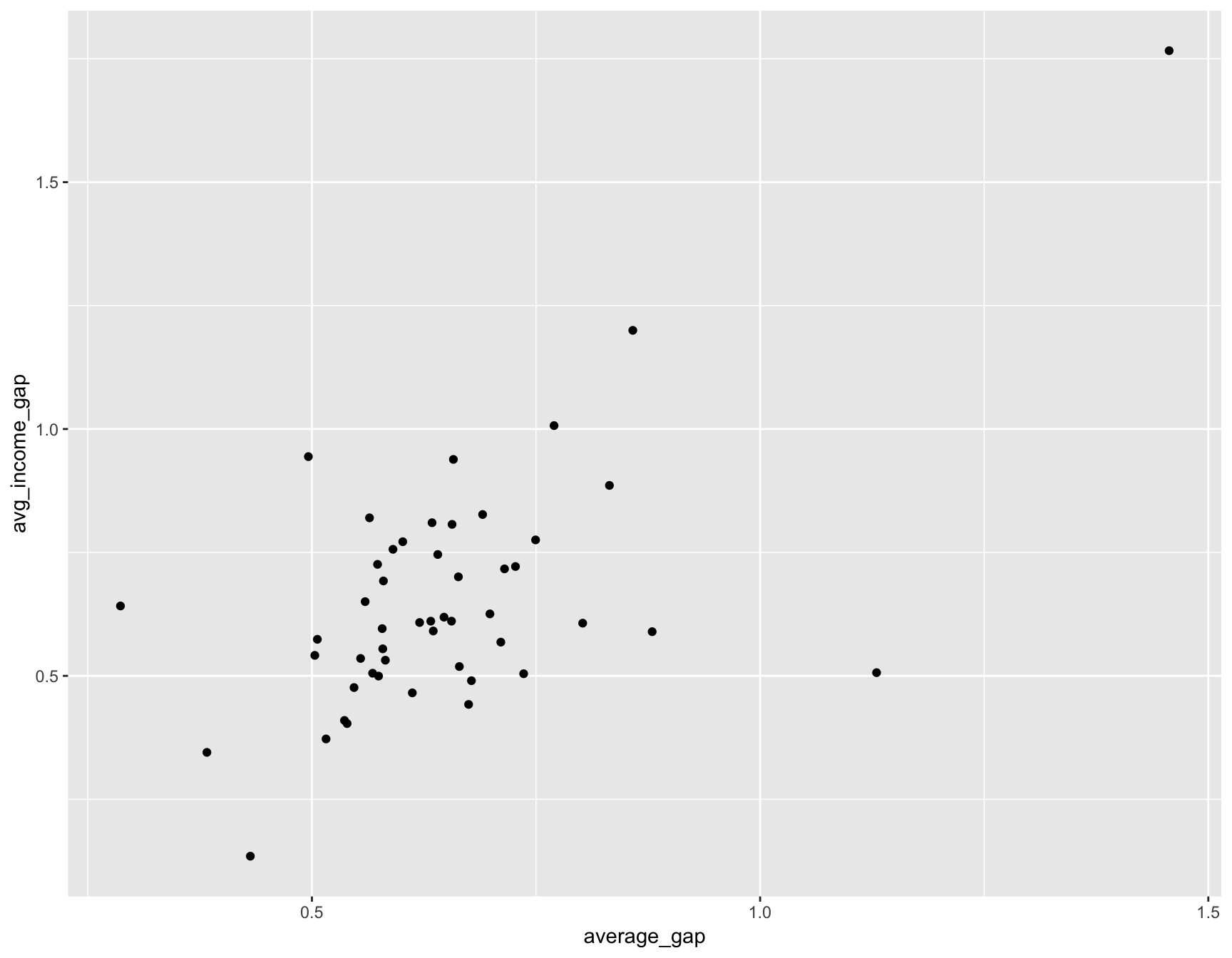
Let’s make a scatterplot comparing the gap in test scores to gap in income.
We’ll use the ggplot2 library.
library(ggplot2)

ggplot(summary_all, aes(average_gap, avg_income_gap)) + geom_point()
## Warning: Removed 2 rows containing missing values (geom_point). That’s a pretty strong chart. The wider the income gap of school districts in a state, the wider the test score gap.
The correlation coefficient is 0.624844 (you can figure this out by typing cor(summary_all$avg_income_gap, summary_all$average_gap, use="complete"))
There are a few outliers, like Vermont, where the test score gap isn’t quite as high as the ingome gap.
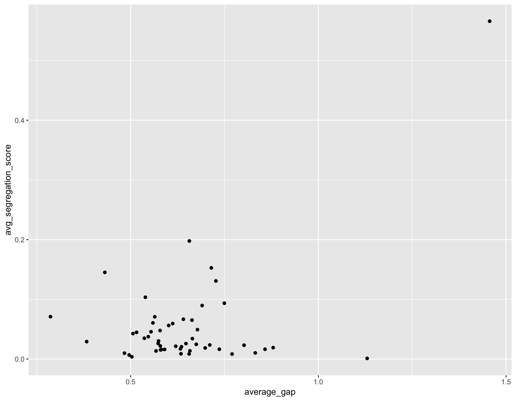
How about the other factor that measured segregation?
ggplot(summary_all, aes(average_gap, avg_segregation_score)) + geom_point()## Warning: Removed 1 rows containing missing values (geom_point).
Well, this chart is less convincing.
It only has a correlation coefficient of 0.5199409 (cor(summary_all$avg_segregation_score, summary_all$average_gap, use="complete")).
This is just the beginning, though.
You could write a script to go through each of the factors in the covariates dataframe and compare them to the factors in the test_gaps dataframe. Or you could try to write a model that predicts the success of students based on those factrs (You’ll be walking in the footsteps of those who’ve done lots of work on this topic already).
Also, the premise of the podcast episode was that Black students improve after moving to a less segregated school. The data we looked at was for a single year. We’d need test scores for a set of students before and after they move to a less segregated score to directly answer those questions. The one we just did was merely a superficial state-by-state snapshot.
But this exercise was to get you to think about answering questions and test ideas with data and some functions in R using dplyr and ggplot2.
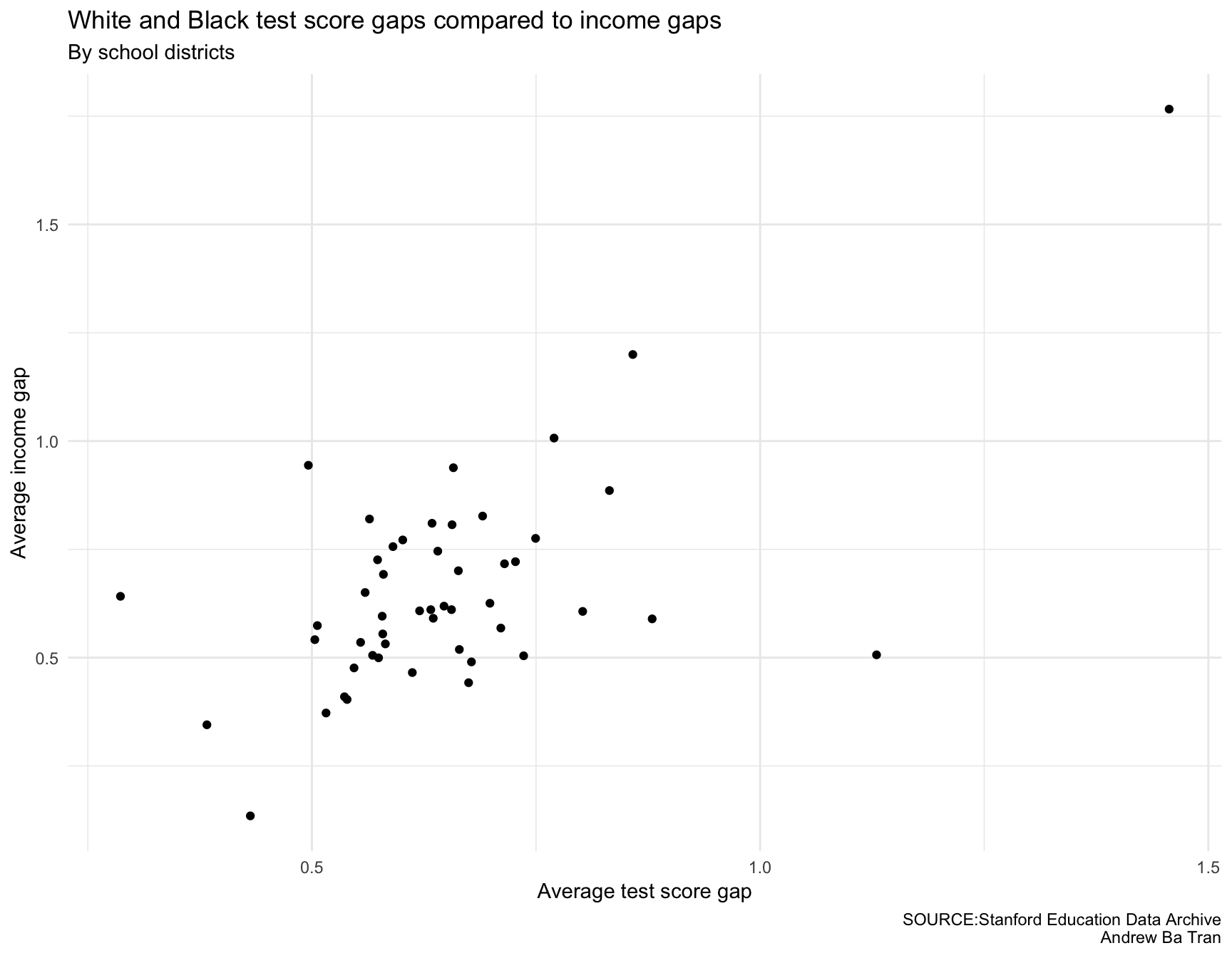
Before we go, let’s clean up the charts a little bit.
Every chart needs these aspects.
- Clean
- Clear labels
- A headline
- Sub title for context if necessary
- Source tag
- Byline
gg <- ggplot(summary_all, aes(average_gap, avg_income_gap)) + geom_point()
gg <- gg + labs(x="Average test score gap", y="Average income gap", title="White and Black test score gaps compared to income gaps", subtitle="By school districts",
                caption="SOURCE:Stanford Education Data Archive\nAndrew Ba Tran")
gg <- gg + theme(panel.border=element_blank())
gg <- gg + theme(panel.grid.minor=element_blank())
gg <- gg + theme_minimal()
gg
## Warning: Removed 2 rows containing missing values (geom_point).
gg <- ggplot(summary_all, aes(average_gap, avg_segregation_score)) + geom_point()
gg <- gg + labs(x="Average test score gap", y="Average segregation score", title="White and Black test score gaps compared to level of segregation", subtitle="By school districts",
                caption="SOURCE:Stanford Education Data Archive\nAndrew Ba Tran")
gg <- gg + theme(panel.border=element_blank())
gg <- gg + theme(panel.grid.minor=element_blank())
gg <- gg + theme_minimal()
gg
## Warning: Removed 1 rows containing missing values (geom_point).